
October 15, 2012; Source: The Rebecca Gordon Group
The Rebecca Gordon Group has compiled information from Forbes, the Giving USA report (which NPQ covered in detail here), the Chronicle of Philanthropy, Atlas of Giving and Johns Hopkins University to create an intriguing visual guide to the complex ways nonprofits influence the economy. The infographic, titled “Nonprofits’ Impact on the Economy,” can be seen here:
Sign up for our free newsletters
Subscribe to NPQ's newsletters to have our top stories delivered directly to your inbox.
By signing up, you agree to our privacy policy and terms of use, and to receive messages from NPQ and our partners.
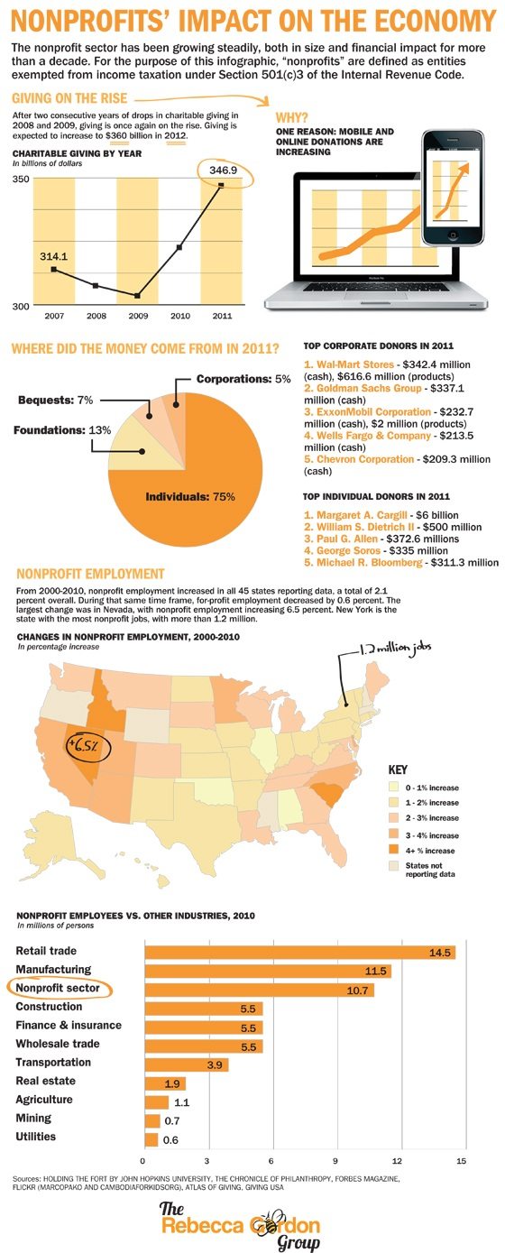
As you can see, the infographic notes resurgence in giving after the doldrums of 2007 through 2009 that coincided with a tanking economy. It also depicts the impact that the nonprofit sector has on employment, which is often overlooked despite the fact that, from 2000 to 2010, nonprofit employment has increased at a higher rate than for-profit employment. We suspect that many outside of nonprofit circles may not realize that the nonprofit sector generates more employment than industries such as real estate, finance and insurance, or construction, so the circulation of an infographic like this may indeed open some eyes.
Whether focusing on voting statistics or the popularity of dog breeds, infographics have become quite a popular tool in the world of online media and digital storytelling. This past summer, The Guardian ran an interesting article on “rising above the glut of infographics,” noting that there are vast amounts of useless infographics being created online today while also acknowledging the valuable capacity for these graphics to turn information into contextualized and easily comprehensible stories. The Rebecca Gordon Group’s graphic is a nice example of how nonprofits can draw upon a multitude of sources in using infographics to tell our stories. –Aine Creedon